Sunday, 15 December 2013

Nescafe Azera Innovation..

The Creative Challenge: 

My creative solution to designing a new product innovation and campaign to launch in store and through social media for Nescafe Azera, is based around a promotional Nescafe Azera container.  I have created a new container which will be a promotional item for period of time whilst buying your normal Azera coffee. The container will be changed to a usable travel cup in the style of a ‘coffee shop coffee, takeaway cup.’ I have chosen this design due the brand promoting itself on the idea that Azera coffee is just like ‘barista coffee’, but in an instant and can be made in the comforts of your own home. I am extending those 
boundaries by allowing Azera coffee lovers to take their coffee with them anywhere they go;  be it on the go to work, or on a mountain trek, all whilst promoting the brand of Azera coffee with their stylized travel cup. This then leads to the social media campaign. I have created with the promotional pack a competition which links together the product innovation. The competition is a chance for people to win £500 by taking pictures of themselves and their new travel cup in interesting and unique places, and posting their pictures online on to the social media network of Facebook. The photograph with the most ‘Likes’ will win the prize. This then encourages people to promote the site by posting online and liking the Azera Facebook page as well as asking their friends to go on to the page to ‘Like’ their photograph to help them win the prize. If that isn’t enough to encourage customers into buying the promotional pack, I have created a ‘mailer’ which would be posted out to coffee lovers through the post, in the promotional pack style and shape, containing a free sample of Azera coffee, and a 25% off voucher for the promotional pack. This will encourage people to take part in the competition, as well as publicizing the social media page. 

Nescafe Azera Innovation idea 2014
Front of container/travel mug
(Banner on the bottom will peel off)
Back of container/ travel mug
(peel off ingredients label)

Mailer/leaflet:
Contains free sample Addressed to coffee lover of that address.
Inside mailer/leaflet:
Contains information of the competition and free 25% promotional discount voucher.


Social Media campaign:
Facebook page where people are able to post their photos to enter the competition.


Saturday, 14 December 2013

Hypochondriaid

A live typographical brief directed by 'International Society of Typographic Designers' where we were to creatively protest about any subject matter we felt needed to be brought to attension. I have chosen the topic of hypochondria, I have created a special supply pack and scheme where in which people can train to become a fully qualified 'hypochondriaid aider' (all based around the theme of first aid.) This is in protest to stop hypochondriacs and people self diagnosing themselves on the internet; wasting valuable doctors time as well as wasting companies money upon unnecessary sick pay and overall in general, stopping peoples over the top moaning!!

Supply pack and poster

Supply kit includes: leaflet, hot pack, not-illatol tablets,
bleeding to death moments plasters, broken ego bandages.

Not-illatol tablets

leaflet advising how to deal with a hypchondriac

Leaflet includes prescription to more not-illatol

Broken ego bandages

How supply kit will arrive

Bleeding to death moments plasters
Emailer that would be sent to companies and businesses

How to deal with a hypochondriac


Tuesday, 19 November 2013

Art of Being Odd...

As part of our university work, we have to share with the world all the little and BIG things that can make us seem a bit odd, quirky.. or just down right barking bonkers...
  • My hands and feet turn purple in less than red hot tropical temperatures.
  • I am constantly cold.
  • I love penguins, I would go to any length to have one as a pet - I promise it could live in my freezer!!
  • I am an old lady trapped in the body of a 22year old. I drink endless amounts of tea.
  • I have the bed time of a small child.. I genuinely believe my bed misses me. 
  • My bug bare is chipped nailvarnish.. My fingers and toes nails have to be painted - no chips.
  •  I am an ex-gymnast.. those who can't do teach, I am now a gymnastic coach and well now and again like to show the kids I can still be 'down' with them.. Never hanging up my leotard!
  • I dislike the smell, taste, and even thought of fish.. Tuna actually makes my skin crawl.
  • I cannot stand mess.. I am that person who tidies up other peoples rooms/houses when they leave the room.
  • I have childrens size 3 feet :( - sad times.
  • I promise my hairdresser every time that I will never cut my own fringe ever again.. I always return apologizing looking like something out of 'This is England'.
  • I prefer talking to strangers on the phone, rather than family members - Sorry guys!
  • There isn't a bone in my body that doesn't crunch, crack or creek.
  • I live in my pjs. If it was socially acceptable to wear them outside the house - I would!
  • I secretly enjoy having something to moan about.. I am a miserable git I know.
  • I have conversations with myself in my sleep.
  • I prefer eating the cake mixture when baking, to the cake.  

Sunday, 3 November 2013

Dyslexie is a typeface for dyslectics.

My new brief is to create a topic of protest, and come up with a campaign using mainly typographic elements. My topic of protest is of 'misused and over exaggerated medical terminology'  focusing mainly on the issues hypochondria and self diagnosis from the internet, and how this effects and wastes that of doctors time.
One of my over exaggerated and misused terms is that of dyslexia, how it is seen a ' popular' disease.. when really most people just are lazy and are unable to spell due to lack of thinking, or mainly - not being able to find spell check!! - In todays society we rely so heavily on computer aided spelling devices - it it built into our smart phones, web search engines, ipads etc.. (how do you think this posting is all spelt correctly!) but when it comes to actually thinking about spelling a word without such use of technology we joke and laugh and brand ourselves as having such a disorder.


So, my topic - I wish to stop people misusing these medical terms, as for the unfortunate people who do have to live with these diseases,illnesses, disorders - how this must affect them, how they see people brand themselves or joke over such serious issues.

With my research into dyslexia I have found that typography and fonts have been developed to help with such situations and how having dyslexia really feels and affects daily life.. 


Thursday, 31 October 2013

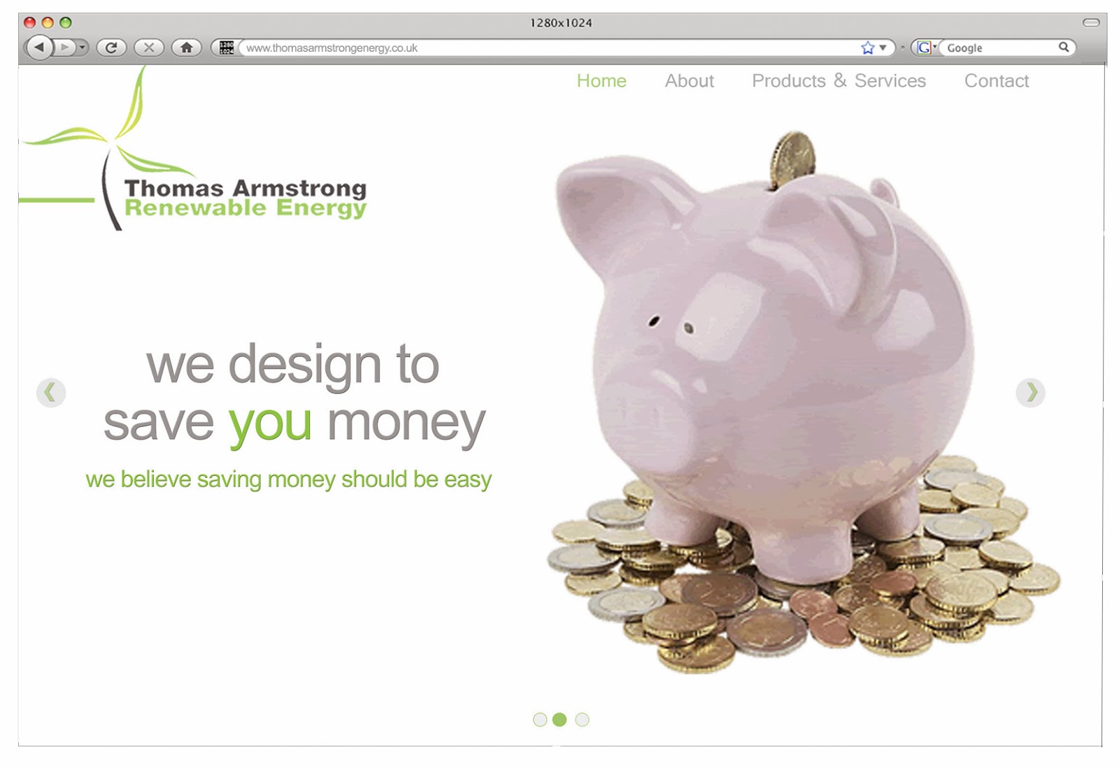
Website Design for..'Thomas Armstrong Renewable Energy'

We as a university year group were asked by the people of Thomas Armstrong Renewable Energy - to recreate and design their website. Their original website lacked direction, it was functional as in the way it worked - but that was about it. It hosted the relevant information for potential buyers to know the different types of renewable energy and what they individually all did, but collectively as a website it didn't provide the quality and reassurance of the companys branding or anything really much else. 
Individually we were to design their website with our own solutions to the problem. My solution was to create and design a website that engaged the viewer/potential client. I wanted to 'sell' not only the products on the website but to 'sell' the whole Thomas Armstrong service and experience. I wanted to show to clients the individual care they give to their customers, from the planning- designing, to installation, to 5/10 years down the line the maintenance services. I wanted the customer to feel individual, and sense that all their energy solutions could be solved by a small phone call to one of the Thomas Armstrong advice team, to book an appointment. 

This is what their current  website: 

This was my designed solution to their website:


I have created a long scrolling website for easy and accessible use, aimed upon their main targeted audiences of farmers and agricultural workers who may not have great time or skills to be trolling for information. I have highlighted the use of the words 'You', 'Your' to make the customers feel individual. Each panel will give a direct link to that section of the website, for example 'Technology that is designed to save you money' will link to straight to the products section of the website. My main focus and goal of the website was to get viewers to book an appointment, therefore the phone number had to be clearly displayed. 
Top section of the website would be a moving panel of a slide show of three slides, describing the main benefactors of Thomas Armstrong. (see other slides below)


Slide Two and Three: 

Products page of website - Selected onto Biomass Heating section:

Contact Page: 


Thursday, 10 October 2013

Paul Laidlaw's Antiques Branding


Our brief was to design and create a branding identity for Paul Laidlaw, an actioneeer from Antiques Roadshow, who is setting up his own auction house in Carlisle.
I have created a full stationary set, letterhead, business cards and envelopes as well as website homepage and advert in which I have set within real advertisements for local auctions. 


Sunday, 29 September 2013

I have placed the 'graphic design tart cards' in areas/spaces of where a designer may work, use etc, playing on the idea that the tart card is usually left in phone box's.

Monday, 23 September 2013

Typeface Tartiness


 These are some of my designs for 'Graphic Design - inspired tart cards.' I have tried to use specific terms that relate to graphic design, such as typeface names, or type related adjustments when designing.  

Thursday, 13 June 2013

'Let's get something straight between us'...

As part of our summer projects we have been asked to create a graphic design business card using only the visual and vernacular language of a a 'tart card.'  Here are a few examples that I have found within my research into the topic.
(Images taken from google images)
These are just a few of the selection that I have found. They all work so well due to their play on words, and witty tone, it creates 
a inside/private joke to designers.


Friday, 11 January 2013

Photo Alteration- a test to my photoshop skills...

Orginal Image - with girl in middle

Altered image - no girl
I was given the task from a friend to see if I was able to remove
  a girl from an old photograph and re-alter the image. ( see orginal image -center with buttoned coat.) 
It was test to my photoshop skills lets just say!!

Wednesday, 9 January 2013

APP-tastic

Homepage
Customise Selection
Shows information of the fabric selected specifically for your sporting needs.
Customise your item by selected your own colours.
Shop part of the app - buy already made prodcuts within the range.


An app based upon the sports performance fabric company to promote the company and products.
The app can be used in two ways - to shop for all ready made products within the brand, or to create and customise your own item specifically for you and your sporting needs to enhance your performance.

I'm ALIVE!!

Visit my website...

I am Live and Kicking, click on the link above to visit my website, where you are able to see more of a selection of my work with full information on projects. 

Mercury - Corporate Identity Guidelines

Logo in colour, black and white, and product logo.

Business card for company


Products and Branding Corporate Guidelines. 


 Performance sports fabric manufacturer.


Art Directed Magazine - Memories Magazine


A magazine based upon memories and how people are able to recall past events, such as looking at old photographs, visiting places, people and even music.


Long awaited Year 2...

 Splash Page

Turn Page


A magazine exploring the depletion of the Arctic and the effects there from it.